Use CSS in Blockly
4. Components
In this section, you will create CSS rules to assign the colours used by the components section of the themes codelab to various components.
To start, create a file named halloween.css and add it to your index.html file:
...
<script src="./index.js"></script>
<link rel="stylesheet" href="halloween.css" />
Main workspace colour
Your first rule will set the background colour of the main workspace. In your Blockly editor, find the <rect> element with the blocklyMainBackground class:
<body>
  <div class="blocklyDiv">
    <div class="injectionDiv">
      <svg class="blocklySvg">
        <g class="blocklyWorkspace">
          <rect class="blocklyMainBackground">
This seems like a good target for your rule, except that the fill property is already used to set the grid pattern. Instead, we'll set the background-color property of the blocklySvg element. To do this, add the following rule to halloween.css:
/**************/
/* COMPONENTS */
/**************/

.blocklySvg {
  background-color: #ff7518;
}
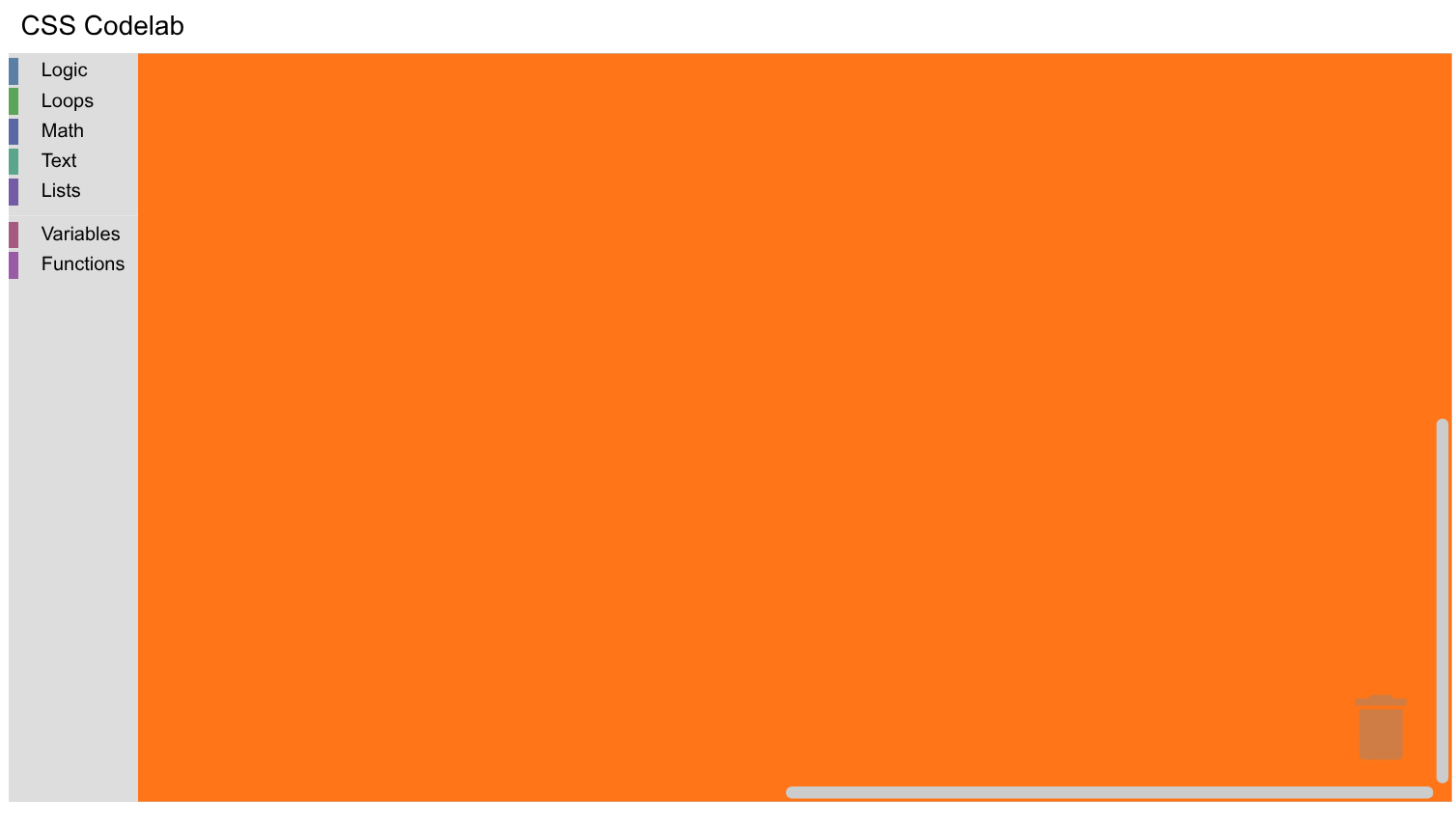
Refresh your page and notice that the workspace background is now orange:
Mutator workspace colour
Now drag an if do block onto the workspace and click the mutator (gear) icon. Notice that the mutator workspace's background colour is unchanged. This is because it's a different workspace. See if you can find the <rect> that draws the mutator workspace. (Here's a hint: It's on the bubble canvas, which is where the bubbles used by mutators, comments, and warnings are drawn.)
Don't worry if you didn't find it right away -- Blockly's DOM tree is fairly complex:
<body>
  <div class="blocklyDiv">
    <div class="injectionDiv">
      <svg class="blocklySvg">
        <g class="blocklyWorkspace">
          <g class="blocklyBubbleCanvas">
            <g class="blocklyMiniWorkspaceBubble">
              <g>
                <svg>
                  <g class="blocklyWorkspace">
                    <rect class="blocklyMutatorBackground">
Next, add a CSS rule to set the workspace's background colour:
.blocklyMutatorBackground {
  fill: #ff7518;
}
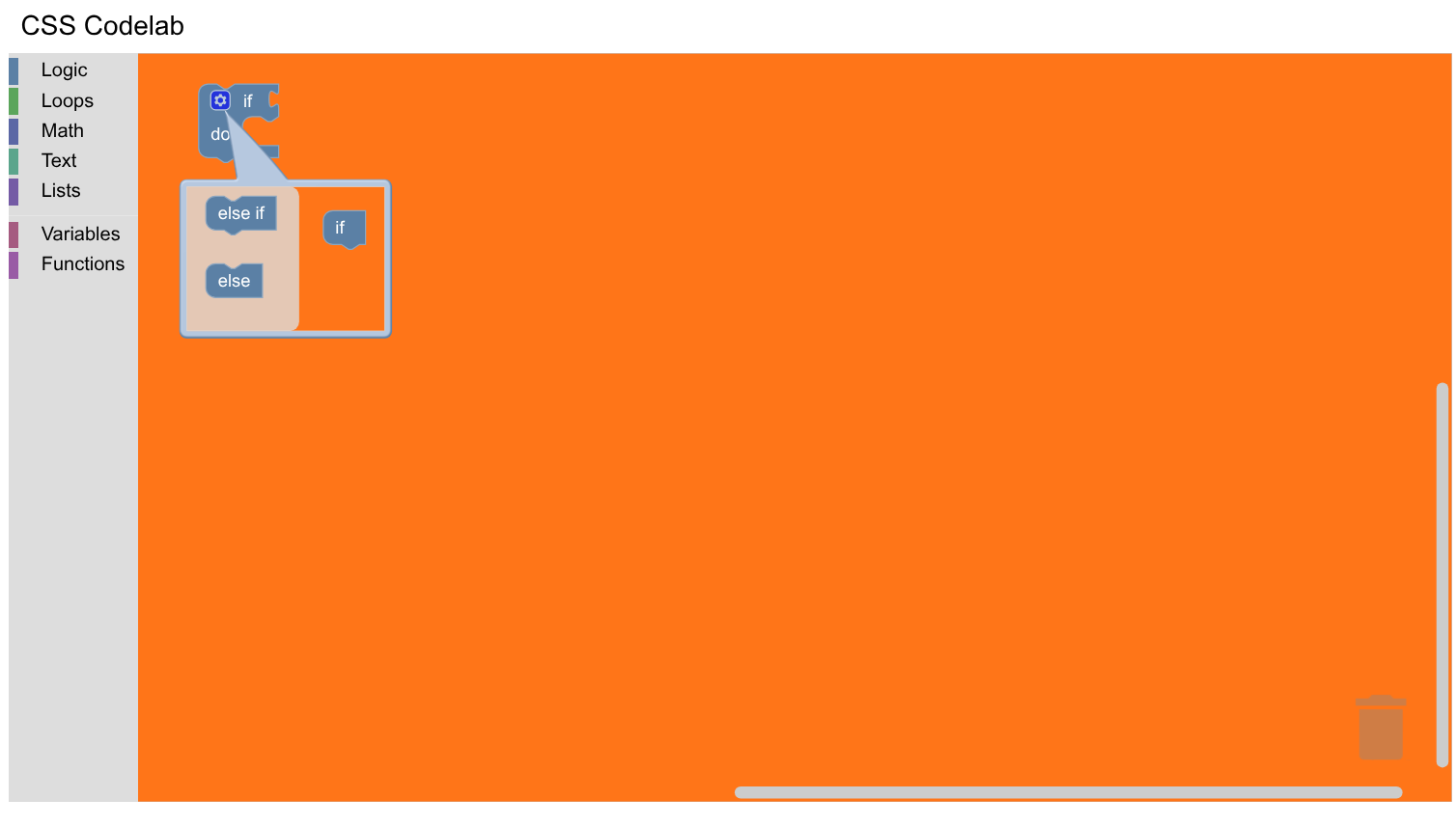
To see your new colours, reload the web page, drag the if do block out again,
and reopen the mutator. You should see that the mutator workspace background
colour is orange, matching the main workspace background:
Other component colours
Themes allow you to define the colours of many (but not all) components. The following table shows what classes and properties to use to set the same colours as the component styles in themes:
| Component style | Selectors (properties) |
|---|---|
workspaceBackgroundColour | .blocklySvg (background-color), .blocklyMutatorBackground (fill) |
toolboxBackgroundColour | .blocklyToolbox (background-color) |
toolboxForegroundColour | .blocklyToolbox (color) |
flyoutBackgroundColour | .blocklyFlyoutBackground (fill) |
flyoutForegroundColour | .blocklyFlyoutLabel > .blocklyFlyoutLabelText (fill), .blocklyFlyoutButton > .blocklyText (fill) |
flyoutOpacity | .blocklyFlyoutBackground (fill-opacity) |
scrollbarColour | .blocklyScrollbarHandle (fill) |
scrollbarOpacity | .blocklyScrollbarHandle (fill-opacity) |
insertionMarkerColour | .blocklyInsertionMarker > .blocklyPath (fill) |
insertionMarkerOpacity | .blocklyInsertionMarker > .blocklyPath (fill-opacity) |
Add the following rules to halloween.css:
.blocklyToolbox {
  background-color: #f9c10e;
  color: #fff;
}

.blocklyFlyoutBackground {
  fill: #252526;
  fill-opacity: 1;
}

.blocklyFlyoutLabel > .blocklyFlyoutLabelText {
  fill: #ccc !important;
}

.blocklyFlyoutButton > .blocklyText {
  fill: #ccc !important;
}

.blocklyScrollbarHandle {
  fill: #ff0000;
  fill-opacity: 0.4;
}

.blocklyInsertionMarker > .blocklyPath {
  fill: #fff !important;
  fill-opacity: 0.3 !important;
  stroke: none;
}
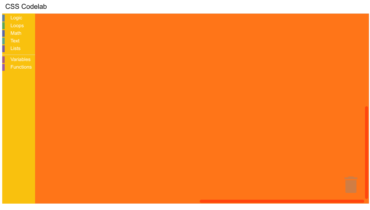
Now reload your page. You should see a Blockly editor with a yellow toolbox and
red scrollbars:
fill vs background-color
You might have noticed that some rules use background-color and color and
others use fill and stroke. This is because background-color and color
apply to HTML elements, like the <div> used by the toolbox, and fill and
stroke apply to most SVG elements, like the <path> used by the flyout
background. (An exception to this is the top-level <svg> element that contains
Blockly, which uses background-color and color.)
The !important declaration
You might have also noticed that some rules use an !important declaration while others don't. This is because Blockly sets colours in several different ways, some of which are easily overridden and some of which aren't.
-
Presentation attributes: These are attributes on SVG elements, such as
fillandstroke. They have a specificity of 0 and are overridden by any rules you write. As you will see later, block colours use presentation attributes. -
<style>tags: Many of Blockly's CSS rules are included via two<style>tags at the start of the<head>tag. Your rules override these if they have the same or higher specificity. For example, the rule for.blocklyScrollbarHandlehas the same specificity as Blockly's rule for this class, but overrides Blockly's rule because it occurs later in the document. On the other hand, the rule for.blocklyFlyoutLabel > .blocklyFlyoutLabelTexthas a lower specificity than Blockly's rule and must override it with an!importantdeclaration. -
Inline styles: These rules are included via a
styleattribute and can only be overridden by an!importantdeclaration. As you will see later, the colour of the arrow in a dropdown field is set with an inline style and must be overridden with!important.
The easiest way to determine how a rule is set is to highlight the appropriate element in the element inspector and look at the corresponding style information. In a few cases, this isn't possible. For example, an insertion marker is created only when you drag a child near its parent and is deleted when you let go of the parent to highlight the insertion marker's element. In these cases, you will need to search Blockly's rules.